Creating a new Africa inspired by colours.
Strategic branding, new logo and identity. Guided by its vision of “Creating a new Africa inspired by colours,” Nigeria-based CAP is on a mission to build a regional paint powerhouse in Africa. Following an integration of its portfolio, including several product brands with overlapping positions, and due to a long-neglected mother brand, there was a clear need to agree on a new brand strategy and platform.
Our client. Chemical & Allied Products Plc (CAP) is Nigeria’s largest and fastest-growing decorative paint brand. Founded some 60 years ago, the Lagos-based group is publicly traded on the Nigerian Stock Exchange and serves a market of 200 million. Today, its portfolio mainly comprises licensed brands such as Dulux, Sandtex and Hammerite. However, it has ambitious plans to strengthen its own corporate brand and fill in the portfolio with locally developed and manufactured products, such as its Caplux brand.
Our assignment. Our main branding challenge was of a strategic and structural nature. First, there was a need to establish a clear position and personality for the CAP mother brand. Primarily, it needed to be strengthened to attract investors and employees. But it also had to symbolize a stamp of quality when used in connection with the product brands. To present CAP in the best way, we also had to agree on how to showcase its full offering, meaning bringing clarity to its product brands. However, with competing brand positionings for several of the brands, we needed to reposition at least one of the brands.
Our solution. Over the course of two days of workshops in Lagos, we organized the sub-brands into clearly defined positions and agreed on the required next steps. For starters, all agreed that further investments in the CAP mother brand were required to better leverage its full potential. In addition to developing a new strategy and brand platform, we needed to revitalize the CAP brand with a new logotype and graphic profile.
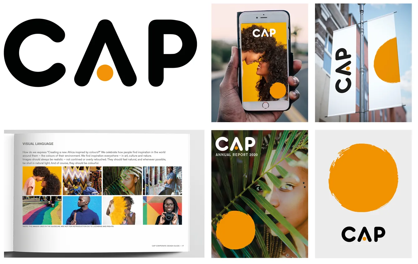
The result. Open delivered a toolbox with basic elements, including a new, clean, simplified logo. The orange circular form captured elements of the older logo but reinterpreted in a modern way. It captured the burning glow of the African sun at the dawn of a new day, breathtaking and magical. It says hope, future and opportunity – all at once. It says CAP.
The CAP circle, which was developed as an identifying shape, captures the essence of the vision. It symbolizes the dawn of a new company and new opportunities for all of Africa. We want people to see a hint of brush strokes, since this makes it more interesting and human than a perfect flat circle. It also links to the CAP business of paint. The new graphic profile is just being rolled out.
The CAP circle, which was developed as an identifying shape, captures the essence of the vision. It symbolizes the dawn of a new company and new opportunities for all of Africa. We want people to see a hint of brush strokes, since this makes it more interesting and human than a perfect flat circle. It also links to the CAP business of paint. The new graphic profile is just being rolled out.